From a very early age I was fascinated with letter forms and typography. I used to spend hours drawing letters as a little kid, pouring over my dad’s Chartapak® dry transfer catalog, which I still have tucked safely on my shelf next to the art history books I spent a fortune on and can’t bear to give away. I saw letters as shapes and forms, drawing the negative space as much as the letter form. Those letters had a voice and I loved how they spoke to me, often in the wee hours when I should have been catching some zzzz’s.

I was in heaven during my early years at RISD taking the first of many typography courses. While others were poking their eyes out with a rapidograph, I was happily drawing helvetica, bodoni and garamond by hand with pen and ink. It wasn’t until I took a stone carving class during wintersession that I realized I was either really crazy or really in love with all things typography. Our teacher talked about these letterforms as if they were people with great personality, and I totally felt what he was saying. I learned more about kerning, leading and letterform by having to commit to carving those letters into stone. Sorry kids, no “command-z.”

I lose sleep over bad typography. It makes my skin crawl as if nails on a chalkboard. I have inadvertently turned my family into typography snobs. My husband and kids point out billboards and ads that have awful kerning, inappropriate font styles, or better yet, lettering that is just beautiful and feels right. Whether you are losing sleep or not, typography has an important place in communicating and a huge role in effective advertising.
“These days people need better ways to communicate to more diverse audiences. We know from experience that what we have to say is much easier to understand if we put it in the right voice.” ~Erik Spiekermann & E.M. Ginger, “Stop Stealing Sheep and Find Out Why Type Works.”
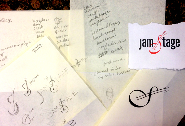
There are tens of thousands of typefaces out there. There is (almost) no such thing as a bad typeface, however, each one has a purpose and appropriate time and place. So what goes into picking the perfect one for a logo or project? When I am designing, the first thing I do is brainstorm words with an “anything goes” rule. The very next thing I do is brainstorm a list of 20-30 fonts that have a voice that could potentially work with or for the logomark. In reality, once the logo is designed, there are probably only a few fonts that truly have the proper feel.

Picking a font is a little like getting dressed. “Just as with clothing, there’s a distinction between typefaces that are expressive and stylish versus those that are useful and appropriate to many situations, and our job is to try to find the right balance for the occasion. While appropriateness isn’t a sexy concept, it’s the acid test that should guide our choice of font.” ~Dan Mayer, “What Font Should I Use?” smashingmagazine.com
For a corporate Identity, I will chose a set of fonts that work well together to communicate effectively and appropriately. It will, at a minimum, consist of a serif family and san serif family and possibly also a headline font. These fonts will have a common underlying element, such as x-height, slant or weight, but will add contrast, interest and legibility, while speaking to the message. Sometimes I rely on my standard workhorses, such as Avenir, Avant Garde, Jenson, Myriad…like the little black dress…classic solid fonts that fit a lot of situations. Other times, I will pick fonts with more flair or character that support the messaging and branding. But every time, the font chosen will be conceptual.
In 1936, Frederick Goudy, a master typographer, was accepting a formal award for his work and was given a hand-lettered certificate to which his immediate reaction was, “Anyone who would letterspace black letter (old english style) would steal sheep.” The poor soul in the audience who painstakingly lettered that award probably learned in a hurry that much care should go into the letter spacing (kerning), line spacing (leading), and format of the font used.

We at Designs by Sandbox are committed to not stealing sheep, filling the world with stellar typographical masterpieces and above all, delivering to our clients pieces that are conceptual and effective, affording our clients (and us!) a good night’s sleep. Contact us to get started….
